
In 2019, I was handed responsibility for everything pertaining to employee compensation at the small distributed software company I was working for at the time. Prior to that point, compensation was managed solely by the company’s founder in a spreadsheet and there was no formal system governing pay. Everyone’s pay was negotiated between individual employees and the founder, and fair rates were estimated using a combination of salary history at other companies, pay ranges for other members in similar roles on the team, and some publicly available market data online.
This informal system had worked reasonably well up to that point. However, it had a lot of problems which included:
- Inequities and inconsistencies. Behind every salary number, there was a story. Pay was more a reflection of an employee’s ability and willingness to negotiate than it was of their value to the company.
- Lack of clarity. Since the rationale was entirely opaque, no employee had any clue what they could expect or hope for in the future and most didn’t understand the basis for their current pay rate.
- Low satisfaction with pay. Through mostly informal channels, I gathered that many members of the team, while mostly happy with the company, did have misgivings or complaints about pay.
- No incentive for growth. Due to the lack of clarity about the future, employees lacked strong motivation to level up.
- Inefficiency and personal anxiety. Because one person (the founder) was making subjective decisions about every person’s pay, the process tended to be time consuming and a source of some anguish. Every decision was second guessed and it was never clear to the founder whether the number both parties had settled on was “right”.
The time had come for something more sophisticated. I was tasked with developing a better system which could help us overcome these problems and set us up for the future.
Project goals
My goals for this project were to create a system which was:
- Fair and equitable
- Transparent
- Easy to understand
- Easy to use
- Scalable
- Data driven
Addressing fairness
The only possible way to truly ensure that pay rates are consistent and fair is to remove subjectivity and discretion. If there are no loopholes or overrides or gray areas, then there will not be any discrepancies either. For every role + level there should be a prescribed amount and that amount is what we pay, end of story.
If you’re in the position I was in and trying to setup your own first pay governance system, prepare yourself: This is a tough pill to swallow for company owners. In every case I’ve encountered, including my own, when such constraints are proposed, owners push back. They will be uncomfortable losing their ability to exercise any discretion in unique situations. A system which is mostly objective will be proposed. I encourage you to stand your ground. Subjectivity leads very directly to pay inequities. If exceptions to the rules are made, the system breaks down.
Brief reflection on pay fairness…
At the heart of this goal is the acknowledgement that there is a single factor which has an enormous impact on pay across all sectors. This factor is a very specific skill which not everyone possesses. If you possess this skill, you will make more money than your counterparts without it.
That skill is negotiating.
Employees who are willing to advocate for themselves, stand their ground, debate, and generally play the game of chess that is salary negotiation, will make considerably more than those unable or unwilling to do so.
The key problem with this reality is the fact that this particular skill is not strongly correlated with the value a given employee can bring to a company. Some jobs do exist in which negotiation is an important skill but there are many more for which it is all but useless. For these reasons, I’m passionate about reducing or eliminating negotiation as a factor affecting pay.
Introducing transparency
I’ve long been a proponent of transparency, broadly speaking, and do believe that more transparency when it comes to pay would be a wonderful thing. When pay systems are opaque, employees will use their imagination and draw their own conclusions. Those conclusions will, more often than not, be wrong and that’s bad for both parties.
The most important lesson I’ve learned about compensation is one that I learned back in grade school: Show your work.
It isn’t enough to tell an employee what their salary will be. It’s necessary also to demonstrate where that number comes from. Employees deserve to understand why they are being offered a specific rate. This is because they 1) don’t need the unproductive anxiety that comes with pondering whether their pay is fair, 2) should know what pay looks like for their profession so they can form an appropriate career strategy, and 3) should have a chance to check your work and call you out if there are errors in your calculations.
When I put together our comp system, I settled on a “semi-transparent” approach. Some companies have embraced fully-transparent systems which make actual employee salaries 100% public. We decided not to disclose, publicly or internally, actual salaries, but instead published ranges for all job levels and all job titles. This way, everyone can see what anyone in any job title can make.
I haven’t yet encountered a compelling case for 100% transparency yet. In my experience, actual numbers tend to produce more confusion until everyone has the full context. Plus, most people are chiefly concerned with the numbers on their own career path.
To provide the transparency we wanted, I created a publicly viewable Google Sheet which had all the same data as our private one, but no people. This one had rows for job titles and then two sets of columns: The first for showing the salary data from each source we include, and the second group of columns showing the min and max salary for each of the six job levels. This sheet was shared with the team and anyone else interested in seeing it.
Making it easy to understand
A comp system can be perfectly fair and extremely logical but if the team doesn’t “get it”, they won’t care much for it. In my research for this project I looked at a lot of other compensation systems and found many which seemed over-engineered. They may be working fine for other companies, but I felt that the step from no system to a system was the biggest step and worked hard to make ours’ approachable by anyone.
I later came to appreciate even more how much beauty there is in simplicity. When the data and the calculations and the logic all make perfect sense, people engage with the system. By that I mean they will ask questions, share ideas, offer critiques, reference it, and become attached to it.
Note: Critiques and suggestions may not intuitively sound like a positive but the reality is if no one has anything to say, it’s probably not right. People offering up ideas and asking questions is usually a good sign because it means they care and aren’t completely confused.
To make it easy to understand, I sacrificed a good deal of sophistication and eliminated virtually all exceptions. By limiting the features and making it work exactly the same for every person and every role, I ended up with something which was delightfully straightforward.
Making it easy to use
A comp system is “used” in three ways:
- Administering. When I’m actually editing and updating the Google Sheet, I’m “using” the system. If I, along with any other administrators, am able to consistently make my data updates and tweaks quickly, with no mistakes, then it’s easy to administer.
- Counseling. When managers are guiding and teaching subordinates regarding their pay, they are “using” the system. If managers are able to make clear and helpful recommendations for their direct reports and address any questions they have about their current and future pay, then it’s easy to counsel.
- Responding. When employees learn how the system works and then modify their behavior to achieve their own personal goals, they are “using” the system. Each time an employee thinks “hey, I’m close to earning a level upgrade which will result in a nice pay raise. Maybe I will volunteer to take on that new project after all…”, the system is doing its job. When employees see the connection between their own growth and pay increases, motivation to improve soars. If employees are studying the system, drawing the correct conclusions, and voluntarily choosing to make performance improvements, then the system is effective and easy to respond to.
This is the really exciting part. When systems like these become a catalyst for growth, we’re really doing our job well. Truly effective compensation systems are not only fair and equitable, they can also inspire a work force to level up. Pro tip: If you’re struggling to persuade your employer to implement a formal compensation system based on the less tangible, “feel good” benefits, leaning into the growth incentives argument can reframe the conversation enough to get the results you want.
To make our system easy to use, I minimized features, removed all exceptions, and spent a lot of time writing and rewriting the internal docs accompanying the system to ensure it was clear.
Addressing scalability
Some consideration was made for the fact that our team size was going to continue increasing as was the number of job titles we recognized. While designing the system, I took great care to make as much of it dynamic and flexible as possible. I built in some toggles so that switching between different sources and calculations would be trivial.
Using real data
The foundation for our entire system was and had to be verifiable market data. Salary benchmark data sources are abundant so the real question is which to use. Many companies choose a single source while some others combine data from multiple sources.
There are two types of salary data:
- Employer survey data. Lots of companies want access to reliable market data and so in exchange for disclosing their own salaries (and typically a lot of money) companies can buy access to databases of compensation data.
- Crowdsourced employee data. Loads of sites online ask visitors to enter in their own salaries, sometimes in exchange for access to their features.
It’s important to understand the differences between these types of data when deciding what to rely on. Employer provided data tends to be more complete, trustworthy, up-to-date, and accurate. However, it is generally expensive to access and oftentimes does reflect very similar figures to the free, crowdsourced databases.
In version 1 of the system I created, we used a blend of data from seven different sources: Glassdoor, Indeed, Monster, Zip Recruiter, Simply Hired, LinkedIn, and PayScale (free edition). This worked reasonably well initially but did have some shortcomings which we addressed in version 2 by adding two paid data sources: PayScale and Culpepper.
The latest version we were using combined the figures for those eight sources. I took a simple average from the seven numbers and used that as the basis for each salary calculation.
How the compensation system I designed actually works
Everything is handled in a single Google Sheet with a few different tabs:
Employees tab
On the first tab, we have our employee data. Here we have rows for employees and columns for employee data such as the employee’s job title, department, tenure, and actual job levels and salaries.
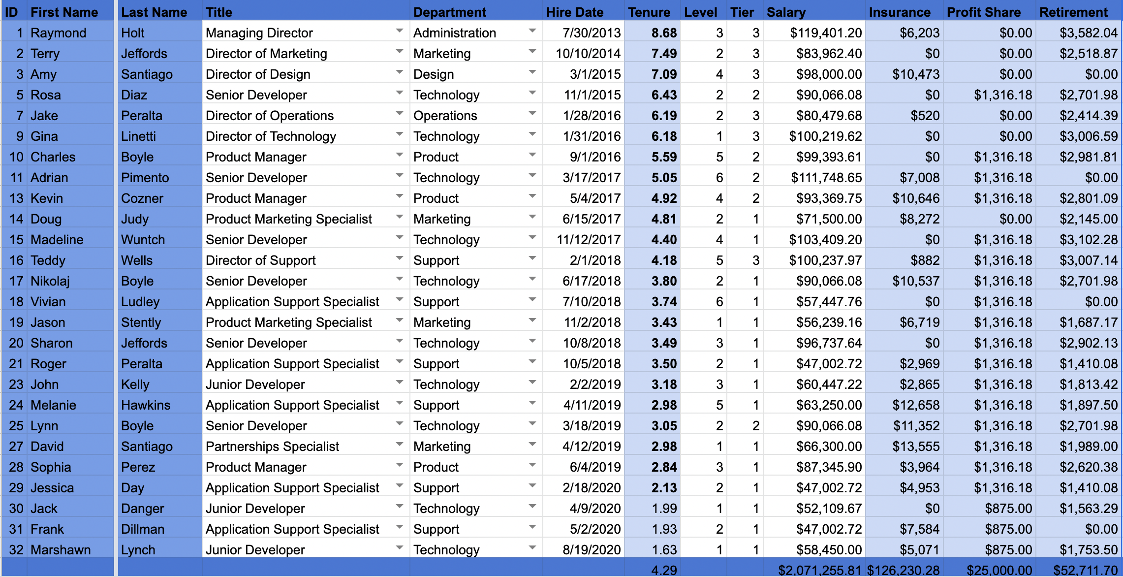
Not shown in that screenshot, taken from a demo version I made, are a lot more columns tracking other costs associated with each employee such as perks and benefits. Those allowed us to have very clear total costs for each individual team member.
Nothing too special or fancy here but the data in this tab is referenced throughout the rest of the sheet.
Data tab
The next tab is where I enter all the salary values pulled from our benchmark sources. Rows are for job titles and columns are sources.
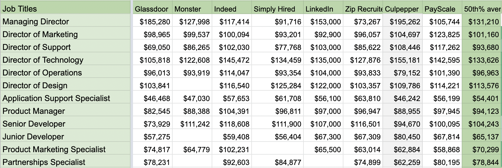
Not shown in this screenshot:
- Identical sections but for different locations. This data is all for Chicago, IL, USA and was accurate as of July 2021. I also pulled data for several other locations initially and when making version 2. I included Portland, San Diego, Houston, and Philadelphia, and had a toggle function elsewhere in the sheet so we could quickly compare data from each city.
- Sections showing the 25th percentile data from each source. We entertained using the 25th percentile initially as our baseline but ultimately settled on using the 50th percentile as shown in the image above.
- A lot of confusing sections I used for essentially checking my data, spotting trends, and comparing data sources.
Salaries tab
The final primary tab, where it all comes together, is the Salaries tab which compares how we are paying to how we should be paying and prescribes amounts for every situation.
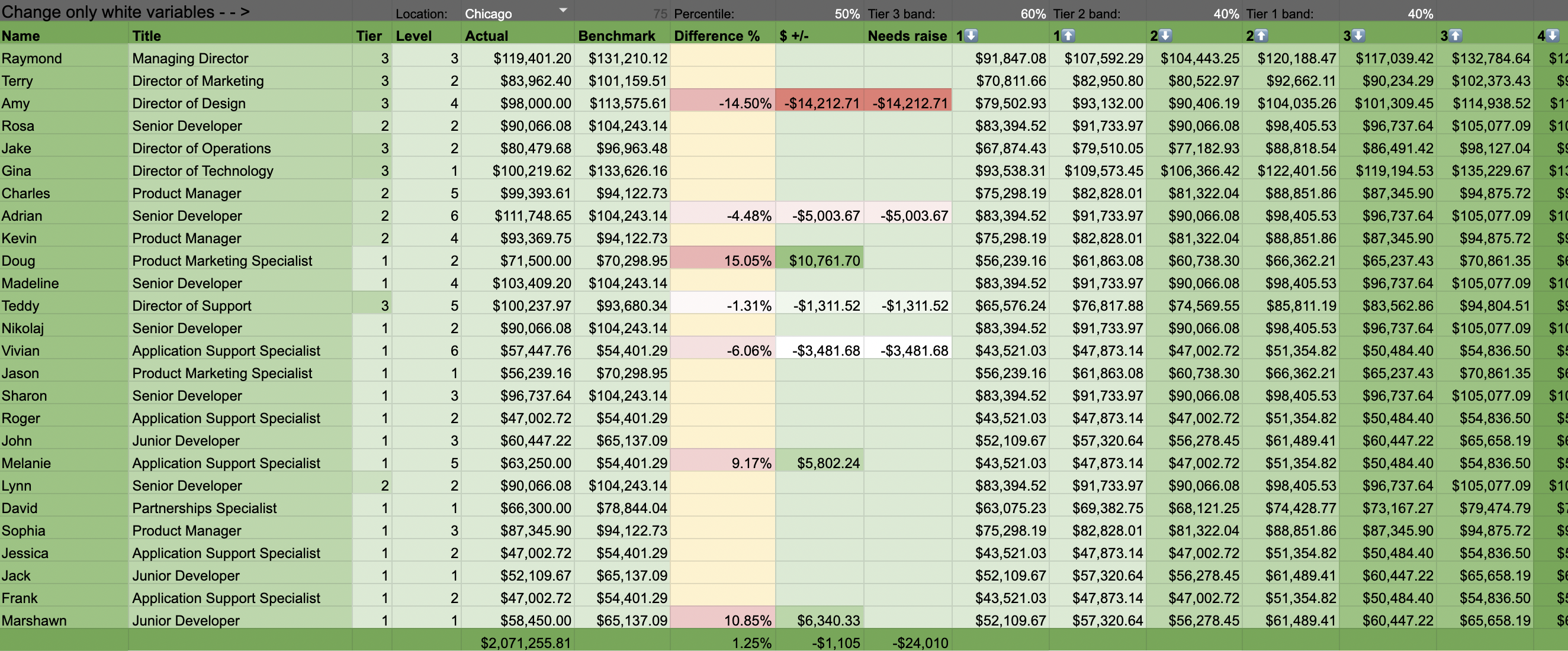
This tab is entirely read only and brings the data from the previous two tabs together to finally tell us what to do.
What you’ll see here is:
- Row 1 does include some variables including a city toggle and numbers used to specify the percentile and the band widths.
- Columns spanning to the right for the min and max at each job level. We had six job levels for every role. This calculation I came up with sets the benchmark value as the midpoint, uses the band width to establish a level 1 min and a level 6 max, and then splits that range into six small, slightly overlapping ranges.
- Columns indicating the + and – differences between what we are actually paying versus what each given employee should be getting paid for their title + role. These alert us to any cases of people being underpaid so that we can give them a raise. They are also handy for viewing a total cost when we toggle between different configurations. If we change the city, benchmark percentile, or band width, the new calculations are reflected instantly and reveal the cost of making the tweak. This was very helpful initially and when making updates because we were able to consider various configurations quickly.
It’s here where the magic happens. Now we have a real system which can connect to a career progression framework and give our team clarity. With this, every person can see how their professional growth translates to salary increases. In this example, Senior Developer Rosa Diaz can see that if she improves in the ways we’ve described in our career progression framework such that she earns an upgrade from level 2 to level 3, her $90,066.08 salary will turn into a $96,737.64.
Insights tab
Another simple tab I made was for extracting some useful tidbits from data elsewhere in the sheet. This tab is a mish-mash of various calculations used to answer random questions I had at one time or another. Any time I pondered something like “I wonder how much one of our all-hands meetings costs…” or “I wonder what the average job level breakdown is for managers vs ICs…” I’d go to this tab and write a quick formula to answer my question.
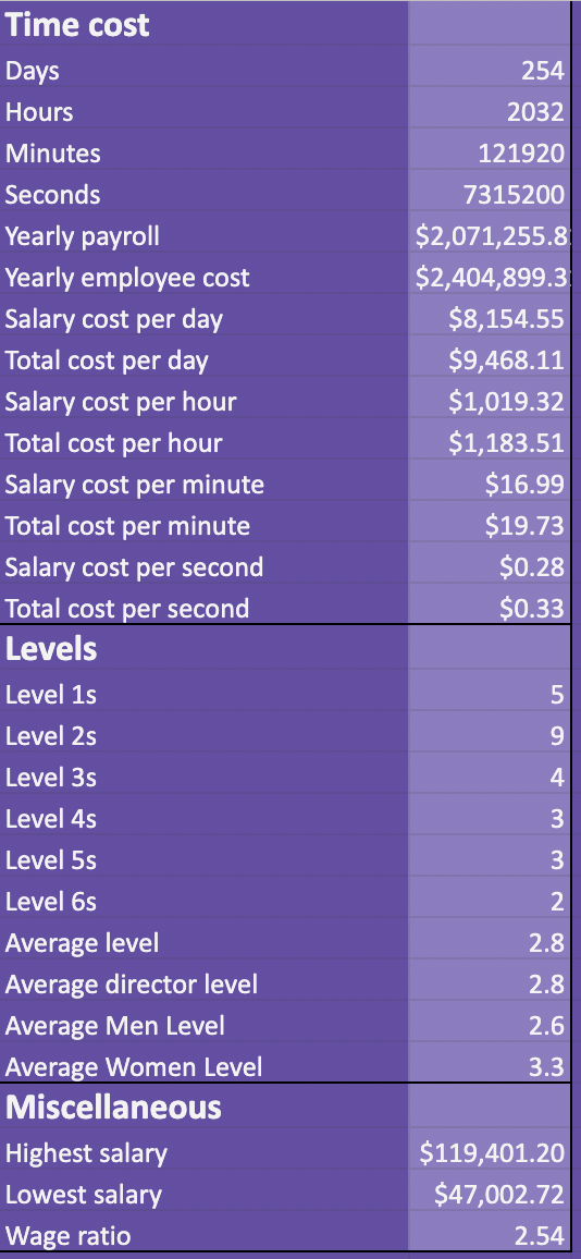
Reminder: This is still pulling from the dummy data in my demo file and does not reflect figures from any real company.
Other tabs
Not much to show so here’s a brief description of what else existed in the same file:
- Raises. Since we did raises on an annual basis and had a consistent calculation for that, I made an easy to use calculator which allowed me to select an employee and see instantly what their raise amount should be.
- Benefits. I kept careful track of benefits utilization overall and this is where it got recorded. This way, I could keep track of the costs associated with each and also be able to see which perks and benefits were actually being used.
- Departments. Another read-only report tab which showed some basic calculations broken down by department. It was useful to understand the total costs associated with each department, diversity breakdowns, average job levels, and so on.
- Other miscellaneous data only tabs. I had a few more which were essentially just places to enter a bunch of data like health insurance costs and exports from salary data sources which were then used to populate values on other tabs.
Results
I finished and fully implemented this system in the summer of 2020. I went out of my way to discuss it with every employee at the company and especially focused on training managers to use it. In the following months I made a number of minor tweaks to the system and improved upon the written documentation.
In March of the following year I sent a survey to the team which asked a series of questions about their compensation. One question asked them to rate their overall satisfaction with our system for determining compensation. Responses were as follows:
- 12% “Unsure”
- 28% “Satisfied”
- 60% “Very satisfied”
These results were very encouraging. Having 88% of employees indicate that they are generally satisfied with our pay system and having 0% say they are “Not satisfied” indicates the project was very successful.
Figuring out what level of satisfaction with pay a company should expect or strive for isn’t easy. Nationally across all jobs in the US, pay satisfaction rates are well below 50%. I’ve had conversations with a couple more experienced compensation professionals who have told me that somewhere in the 60% “satisfied” range is a good rule of thumb.
There you have it! Any questions or comments, just chime in below. I’m always interested in learning more about how other companies design their compensation strategy and systems so please share.
Hey! Hope you are doing well! Wondered if you thought about putting this together into a Google Sheet for people to copy. Could even make it a decent little eCommerce product download. 😉
Hey AJ. That’s not a bad idea. I am open to it. Since this was only the first comp system I’ve designed, I figured I should get a little more validation that it’s solid before dreaming up anything bigger. If I get a bit more positive feedback, I may try and package it up somehow.
For now, I actually do have a demo Google Sheet that I’m willing to share with anyone who reaches out. I think I’d rather people reach out just so I can ask them questions and learn more before I take it any farther.
Thanks for the cool suggestion!
I’d love to see the demo sheet if you are open to it. 🙂 I think it’s insanely valuable and something I’m keen to diving deeper in as I look at help supply benchmarks and building growth paths at the startup I’m at. Feel free to shoot me an email if you’re interested.
Very cool man! Just sent you an email with a link to my demo sheet.
If anyone else wants access, just let me know.
I’d love to see a copy of the demo sheet as well. Email me?
Very cool. Just sent it your way Andy, thanks!